Prime Video Redesign
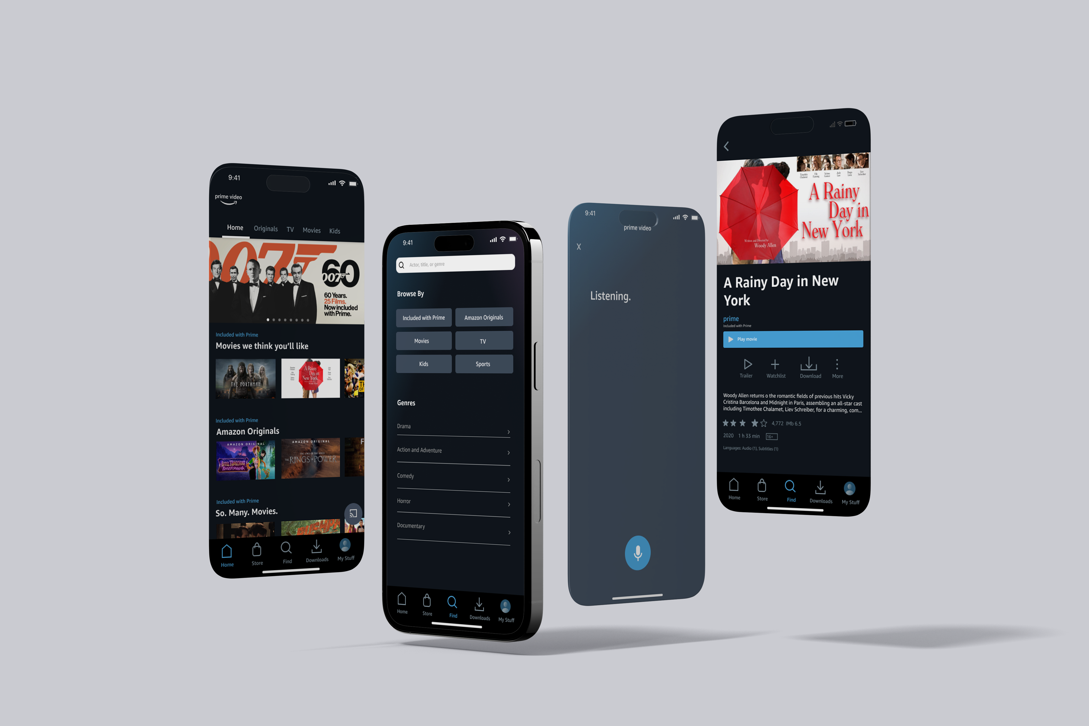
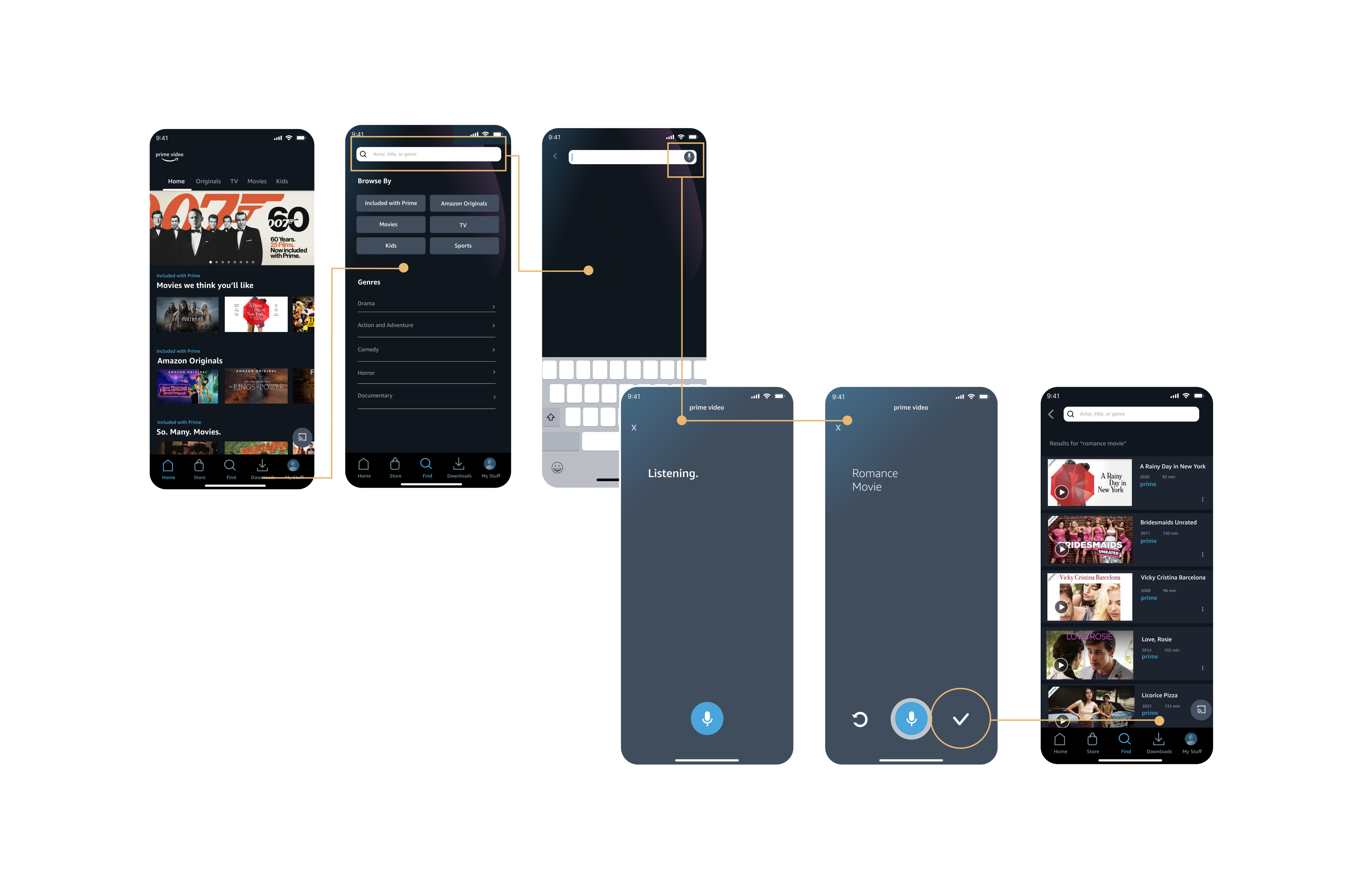
Overview: Implemented a voice-to-search feature to increase efficiency for users streaming experience.
Context: Introduction to Interaction Design
Duration: 5 weeks
Applied methods: rapid usability testing, think aloud interview, heuristic
evaluation,
A/B testing, site mapping, wireframing. Composing the information
architecture,
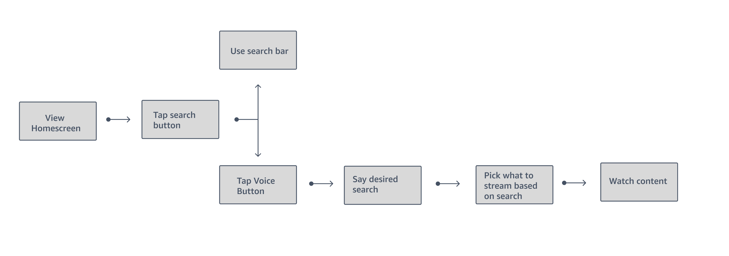
user peronas, and user flow diagrams.
Tools: Figma
Initial Research
Began the project with various methods to gain an understanding of the original platforms design patterns and how users navigate and achieve their goals throughout the interface.
Desk Research Evaluation
Sourcing critiques and pain points from Prime Video’s app
store comments and medium posts. Relevant findings there was an issue with overwhelming
advertisements and tiles and further usability complaints comparing the
features when using different devices.
Heuristic Evaluation
Using Neilson’s usability heuristics, I found Recognition
Rather Than Recall at the lowest severity within the platform and Minimalist Design
at the highest severity. The home screen has stacked tab bars since it is balancing
the search for the Amazon Store and Prime Video; I found this visually busy
especially with the color of the Amazon Store tab bar being visually prioritized
despite the user being on the Prime Video site.
Rapid Usability Testing / Think Aloud Method
Assessment focusing on participants thoughts on the
usefulness of the current Prime Video mobile app and desktop version. Prepared three
tasks and had participants verbalize any errors or positive findings. My goal was to attain
feedback from the participant that would narrow down to what features I could
improve within the original UX.
Desk Research Evaluation
Sourcing critiques and pain points from Prime Video’s app store comments and medium posts. Relevant findings there was an issue with overwhelming advertisements and tiles and further usability complaints comparing the features when using different devices.
Heuristic Evaluation
Using Neilson’s usability heuristics, I found Recognition Rather Than Recall at the lowest severity within the platform and Minimalist Design at the highest severity. The home screen has stacked tab bars since it is balancing the search for the Amazon Store and Prime Video; I found this visually busy especially with the color of the Amazon Store tab bar being visually prioritized despite the user being on the Prime Video site.
Rapid Usability Testing / Think Aloud Method
Assessment focusing on participants thoughts on the usefulness of the current Prime Video mobile app and desktop version. Prepared three tasks and had participants verbalize any errors or positive findings. My goal was to attain feedback from the participant that would narrow down to what features I could improve within the original UX.
Ideation
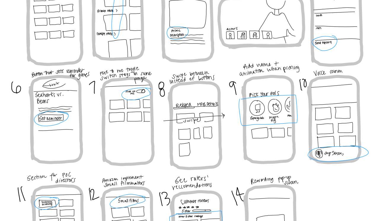
After 30 sketches of different ideas, I downselected 10 and a voice-to-search feature was one idea out of ten low-fidelity screens. With support of the various methods of evaluation, I recognized the problem of repetitious headers and graphics; this feature can turn an overwhelming experience into a simpler streaming experience.


Multiple variations of the concept for users to test.
︎︎︎ User testing Questions
o Can users complete the tasks easily?
o Is this feature valuable to users?
o How is the aesthetic of the interface engaging or pleasurable?
o What do you think about this design?
o Is this interface easy to use?
o What are the most annoying steps to complete the task?
.
Actionable Feedback
• Location of the button on search screen, having it on the
home screen is not clear enough what the function of the
button would serve
• Having the listening screen be clear for users that it is
still
on the app, can get confused with Siri
• Unlike the original Prime Video design, having the search
field remain at the top of the screen after the voice
search is completed.
• Location of the button on search screen, having it on the
home screen is not clear enough what the function of the
button would serve
• Having the listening screen be clear for users that it is
still on the app, can get confused with Siri
• Unlike the original Prime Video design, having the search
field remain at the top of the screen after the voice
search is completed.
Early Variation 1


Early Variation 2


A/B Testing
Goal: To increase use of voice-to-text button
Primary metric: Click-through rate, how many people
successfully search using voice-to-text
Hypthesis: I think adding a redo and confirm button to the screen would help the microconversions of the app


Final Deliverables

