Apple Maps Culture Layer
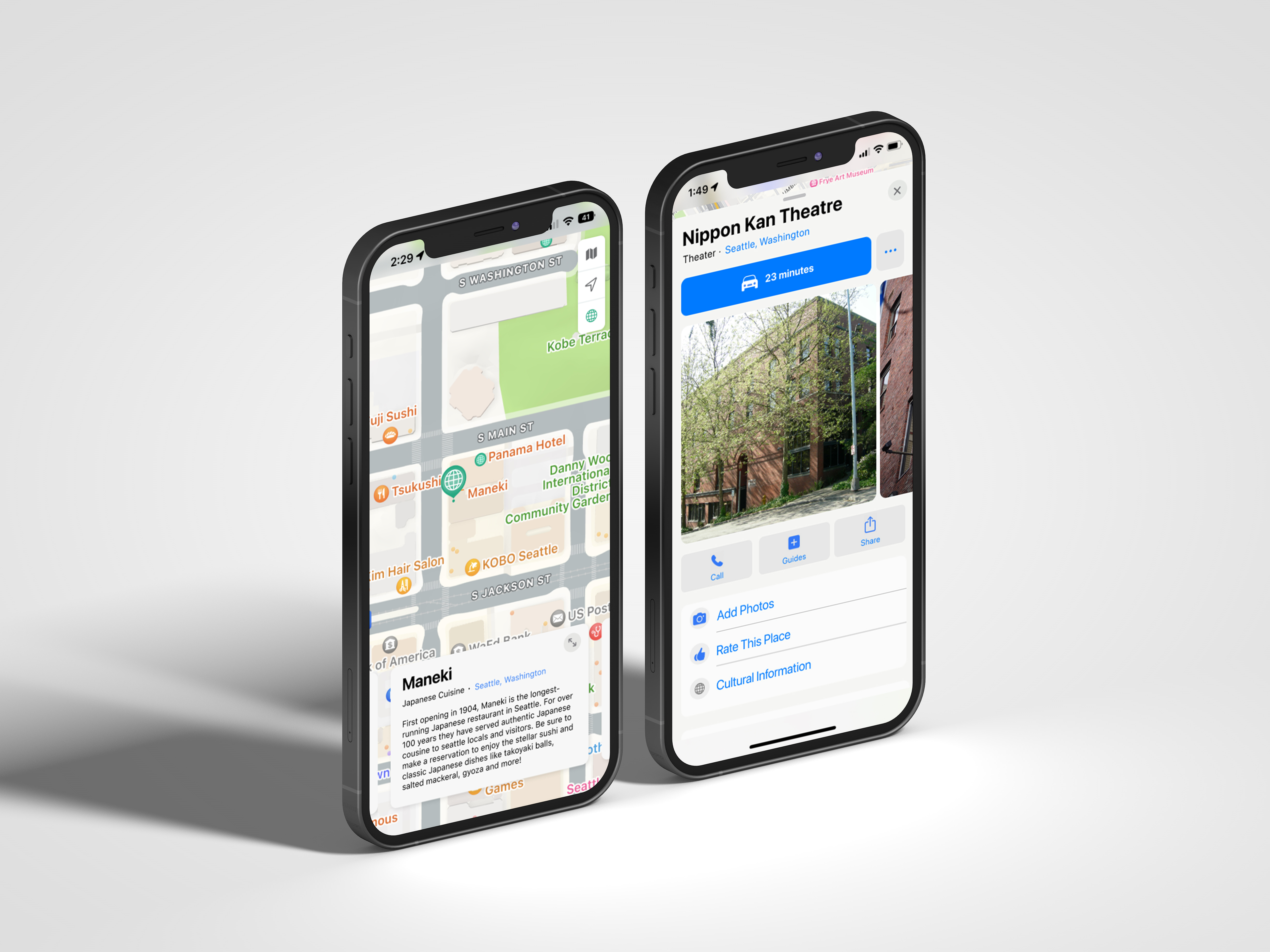
Overview: Two ways users can use feature on Apple Maps
that increases users’ cultural awareness
that increases users’ cultural awareness
Context: Introduction to Interaction Design
Team: Faith Ong & Evelynn Li
Applied methods: Crazy 8s, competitive analysis, rapid user research,
prototyping, wireframing, information architecture, user flows
Team: Faith Ong & Evelynn Li
Applied methods: Crazy 8s, competitive analysis, rapid user research,
prototyping, wireframing, information architecture, user flows
Problem
︎︎︎ Cultural ignorance and laziness
Our team realized cultural education and awareness is often not prioritized and is typically a low priority feature within big platforms, which can lead to a prone to cultural misunderstandings and offenses, and general lack of empathy.
Background Research
We wanted to learn how important it is for users to learn about different cultures.
How important is cultural awareness to you?
Out of 10 average
9.3
Out of 10 average
What resources do you use when wanting to learn about a new culture?
• Google
• Social media
• School events
Was there ever a time you felt culturally uneducated visiting a new place?
Have experienced this feeling.
75%
Have experienced this feeling.
Relevant Insights
Users are aware of the benefits of cultural awareness day-to-day and while traveling
Should provide educational opportunity of the history of different places
Former iterations

Rationale for not moving forward:
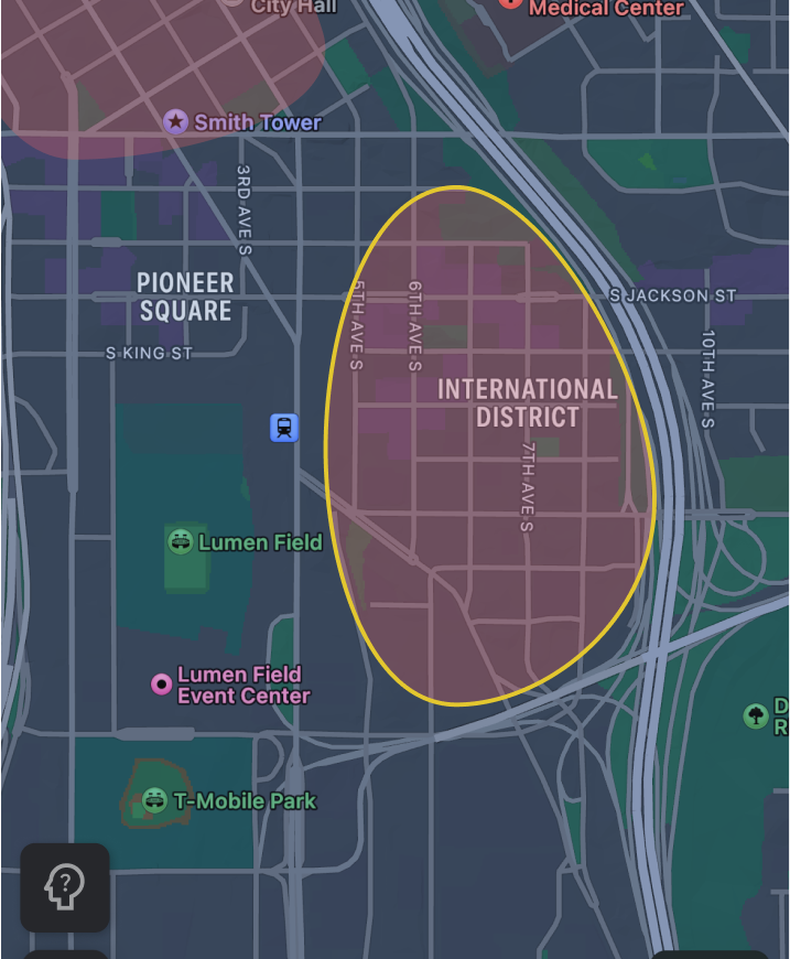
Idea for highlighting where denser cultural
information is did not adhere visually to
current design language.

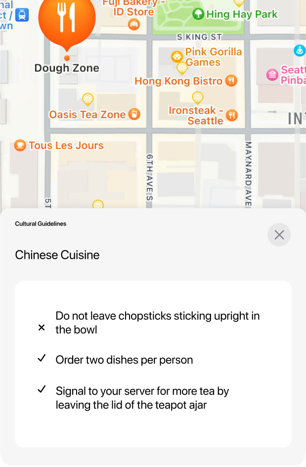
Rationale for not moving forward:
Card with cultural guideline information that
should be lower in the hierarchy; plays too high
of a role in the information architecture despite the information not being of greatest user value.

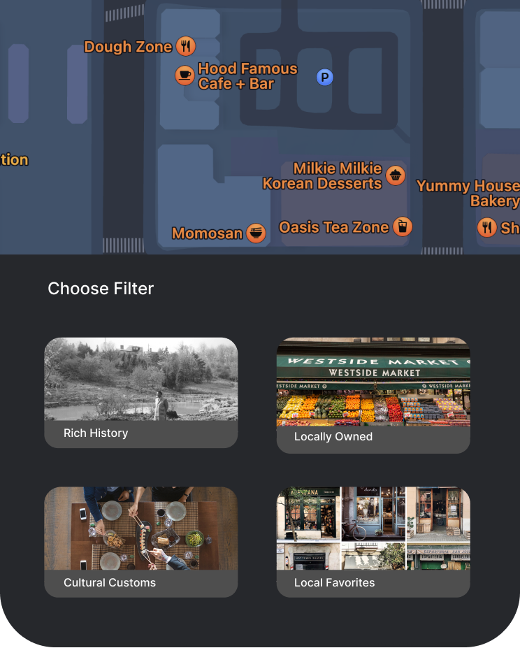
Rationale for not moving forward:
Having a drawer with filters did not draw
enough focus to our goal of cultural education;
knew there was a better way to design for
this user goal.
User Testing Prototype
Relevant user insight on usability:
“I would read the information if I had the time, but if I was in a hurry I wouldn’t but try to read later.”
Relevant user feedback on funtionality:
“Once you know how it works and what its for, its seems very self-explanatory”
User Journeys
Based off our user testing, we noticed that this feature
would be mainly used while users are traveling or have extra
time to browse the map, but not as likely to use it when simply
heading to a destination in their day-to-day life. These
insights supported our design rationales by creating two
different flows that would show this feature.

