Prime Video Redesign
Overview: Implemented a voice-to-search feature to increase efficiency for users streaming experience.
Context: Introduction to Interaction Design
Duration: 5 weeks
Applied methods: rapid usability testing, think aloud interview, heuristic
evaluation,
A/B testing, site mapping, wireframing. Composing the information
architecture,
user peronas, and user flow diagrams.
Tools: Figma
Initial Research
Began the project with various methods to gain an understanding of the original platforms design patterns and how users navigate and achieve their goals throughout the interface.
Desk Research Evaluation
Sourcing critiques and pain points from Prime Video’s app
store comments and medium posts. Relevant findings there was an issue with overwhelming
advertisements and tiles and further usability complaints comparing the
features when using different devices.
Heuristic Evaluation
Using Neilson’s usability heuristics, I found Recognition
Rather Than Recall at the lowest severity within the platform and Minimalist Design
at the highest severity. The home screen has stacked tab bars since it is balancing
the search for the Amazon Store and Prime Video; I found this visually busy
especially with the color of the Amazon Store tab bar being visually prioritized
despite the user being on the Prime Video site.
Rapid Usability Testing / Think Aloud Method
Assessment focusing on participants thoughts on the
usefulness of the current Prime Video mobile app and desktop version. Prepared three
tasks and had participants verbalize any errors or positive findings. My goal was to attain
feedback from the participant that would narrow down to what features I could
improve within the original UX.
Desk Research Evaluation
Sourcing critiques and pain points from Prime Video’s app store comments and medium posts. Relevant findings there was an issue with overwhelming advertisements and tiles and further usability complaints comparing the features when using different devices.
Heuristic Evaluation
Using Neilson’s usability heuristics, I found Recognition Rather Than Recall at the lowest severity within the platform and Minimalist Design at the highest severity. The home screen has stacked tab bars since it is balancing the search for the Amazon Store and Prime Video; I found this visually busy especially with the color of the Amazon Store tab bar being visually prioritized despite the user being on the Prime Video site.
Rapid Usability Testing / Think Aloud Method
Assessment focusing on participants thoughts on the usefulness of the current Prime Video mobile app and desktop version. Prepared three tasks and had participants verbalize any errors or positive findings. My goal was to attain feedback from the participant that would narrow down to what features I could improve within the original UX.
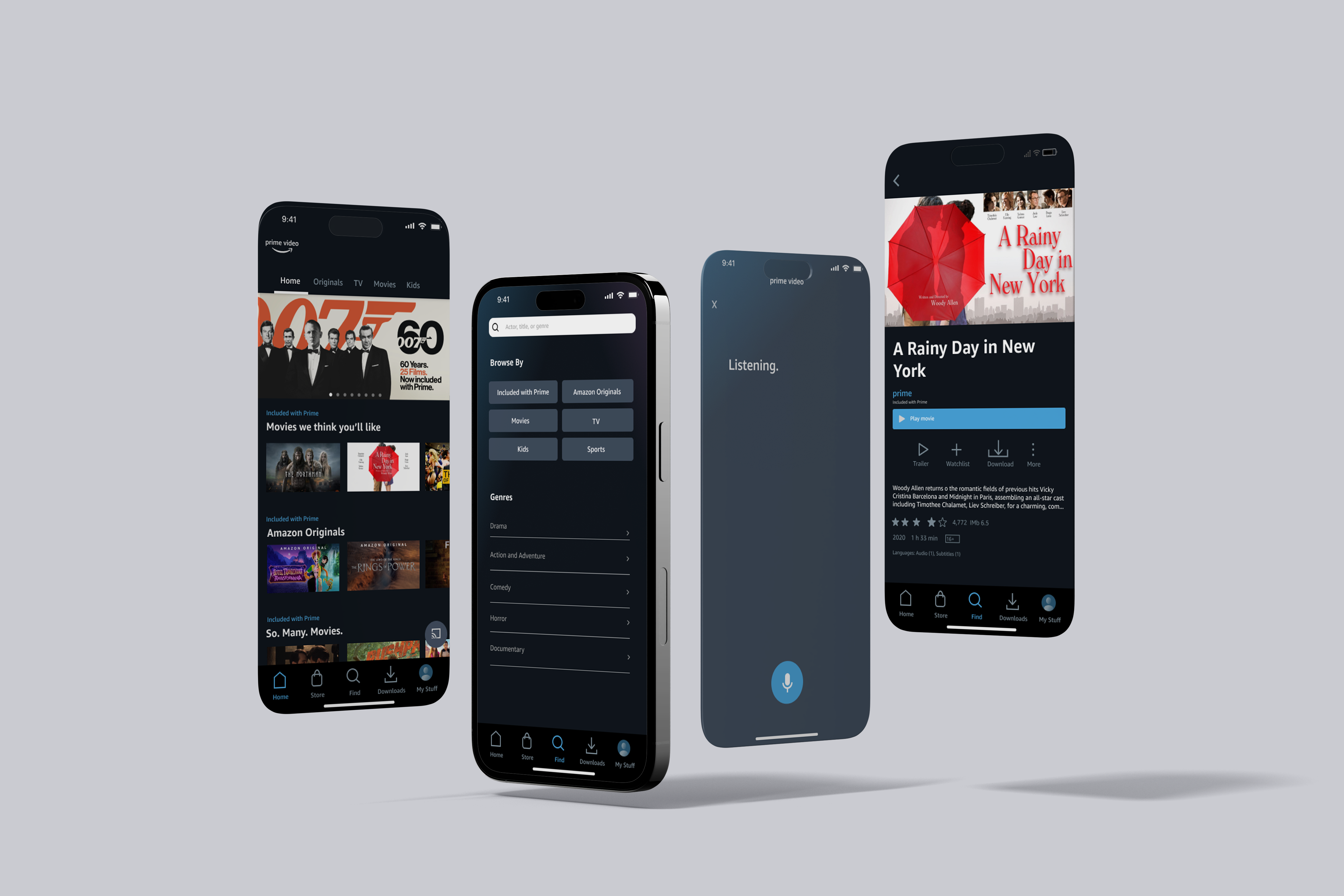
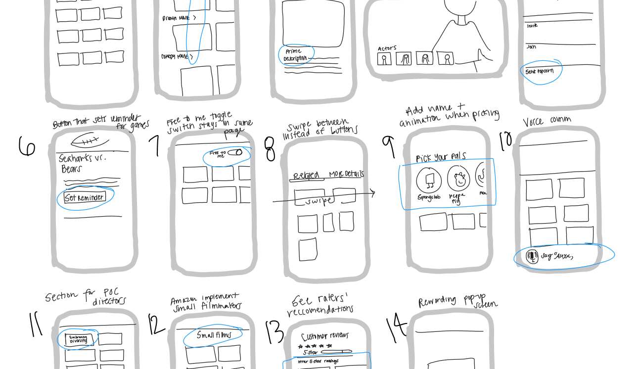
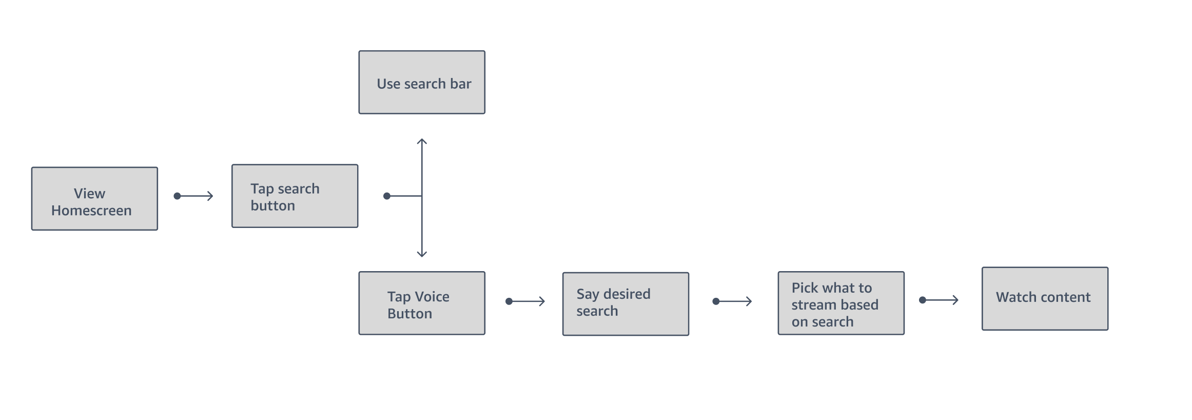
Ideation
After 30 sketches of different ideas, I downselected 10 and a voice-to-search feature was one idea out of ten low-fidelity screens. With support of the various methods of evaluation, I recognized the problem of repetitious headers and graphics; this feature can turn an overwhelming experience into a simpler streaming experience.

Multiple variations of the concept for users to test.
︎︎︎ User testing Questions
o Can users complete the tasks easily?
o Is this feature valuable to users?
o How is the aesthetic of the interface engaging or pleasurable?
o What do you think about this design?
o Is this interface easy to use?
o What are the most annoying steps to complete the task?
.
Actionable Feedback
• Location of the button on search screen, having it on the
home screen is not clear enough what the function of the
button would serve
• Having the listening screen be clear for users that it is
still
on the app, can get confused with Siri
• Unlike the original Prime Video design, having the search
field remain at the top of the screen after the voice
search is completed.
• Location of the button on search screen, having it on the
home screen is not clear enough what the function of the
button would serve
• Having the listening screen be clear for users that it is
still on the app, can get confused with Siri
• Unlike the original Prime Video design, having the search
field remain at the top of the screen after the voice
search is completed.
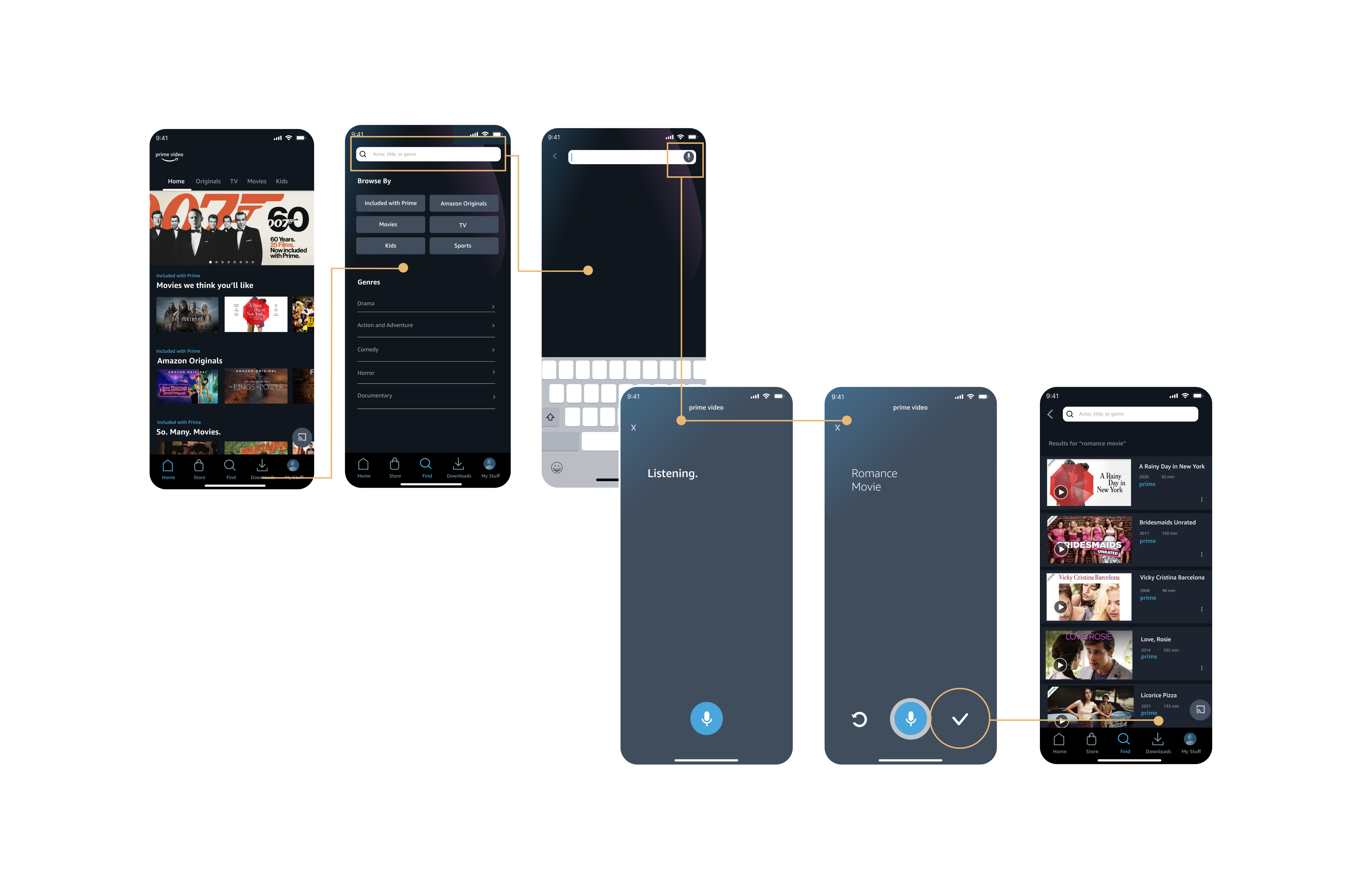
Early Variation 1


Early Variation 2


A/B Testing
Goal: To increase use of voice-to-text button
Primary metric: Click-through rate, how many people
successfully search using voice-to-text
Hypthesis: I think adding a redo and confirm button to the screen would help the microconversions of the app


Final Deliverables
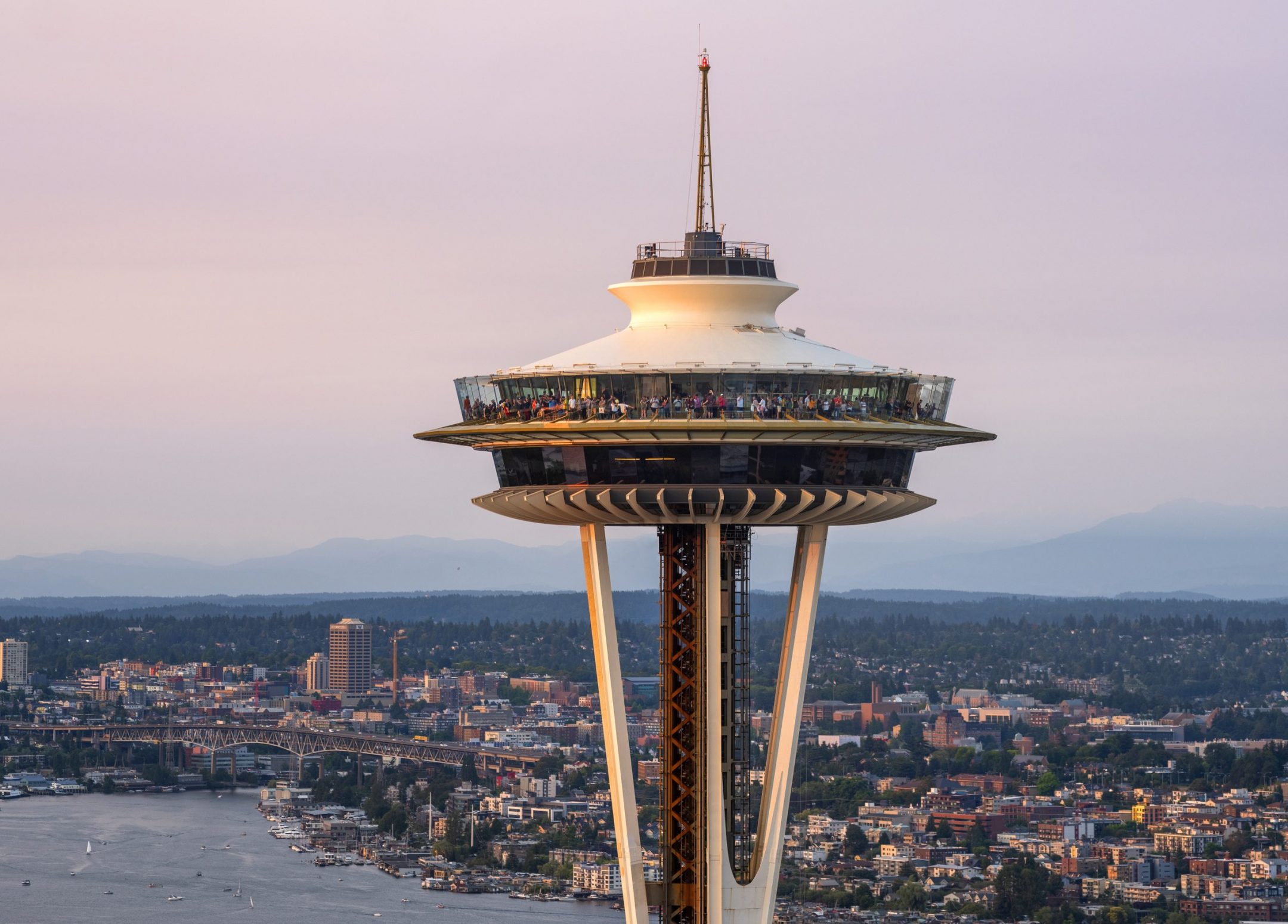
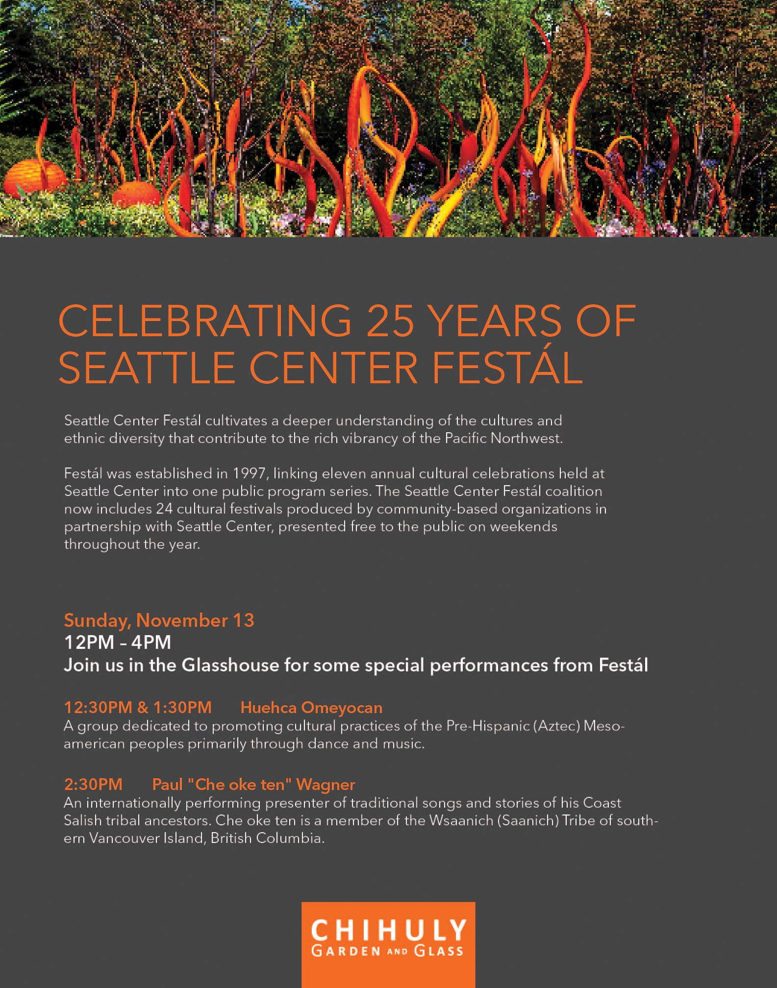
Design Internship @ the Needle
Sole design intern at the Space Needle and Chihuly Garden and Glass
focusing on visual design, marketing, and guest research.
Position
Design and Marketing
Intern
Timeline
September 2022 - Present
Tools Used
Adobe Illustrator
Adobe Photoshop
Learnings
1. Advantages of a large skillset when collaborating
Reached out to various professionals in the company and rode
shotgun on a large variety of projects with my vast interest in different
branches of design. Along with main collaboration with Creative Director and
Marketing Manager, additionally got to make some edits to the Space Needle
website in connection with the Web Editor and learn firsthand on interaction
design projects with the Project Manager.
2. Importance of time management and prioritization
Working for the Space Needle, everyday was different with its
large impact and influence in Seattle, meaning project deadlines and upcoming
events were sporadic at times. This kept me on my feet, and I learned that good
communication is paramount when projects start overlapping.
Delivered and upcoming works ︎︎︎


︎︎︎ Check back soon to read about my overall internship experience.
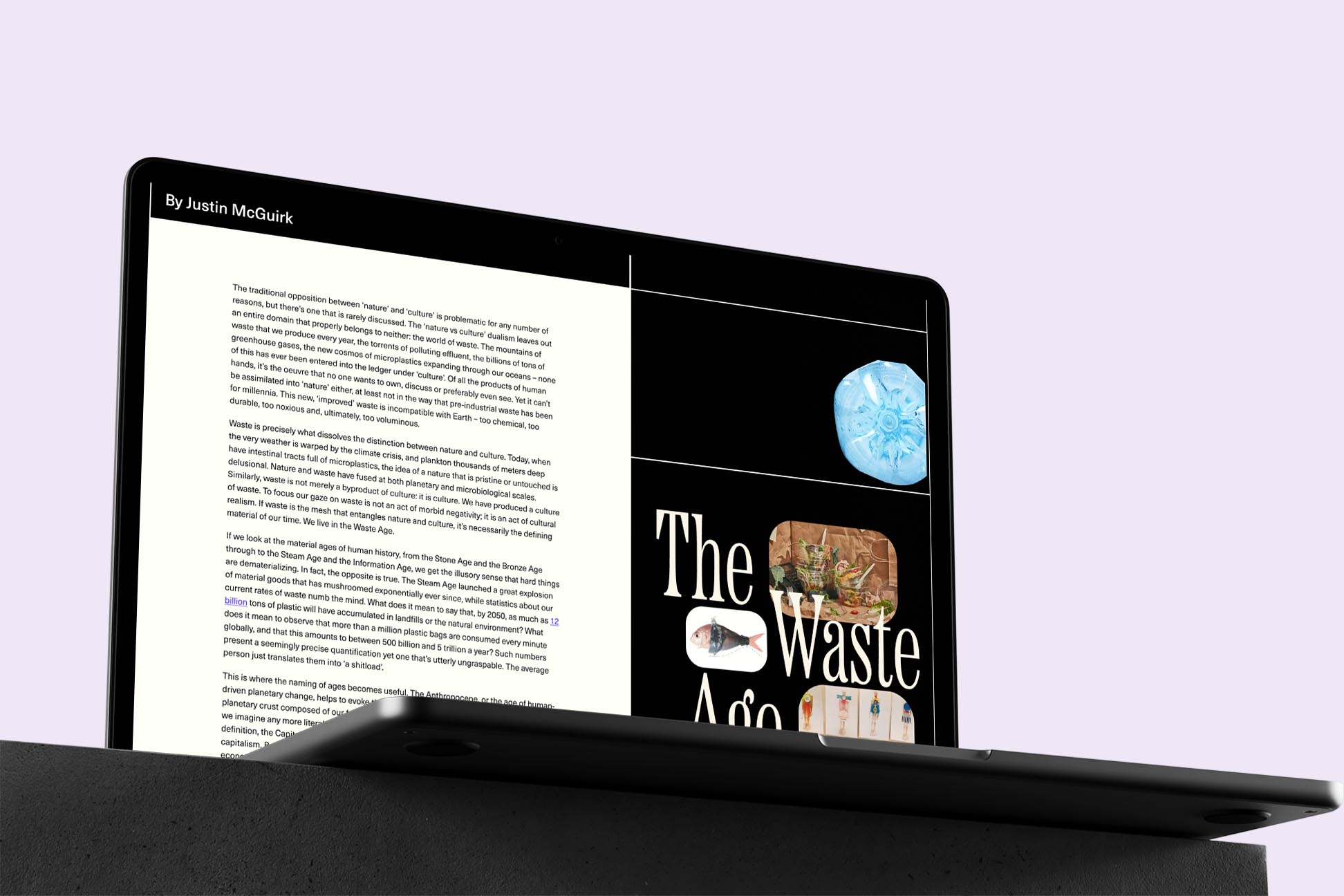
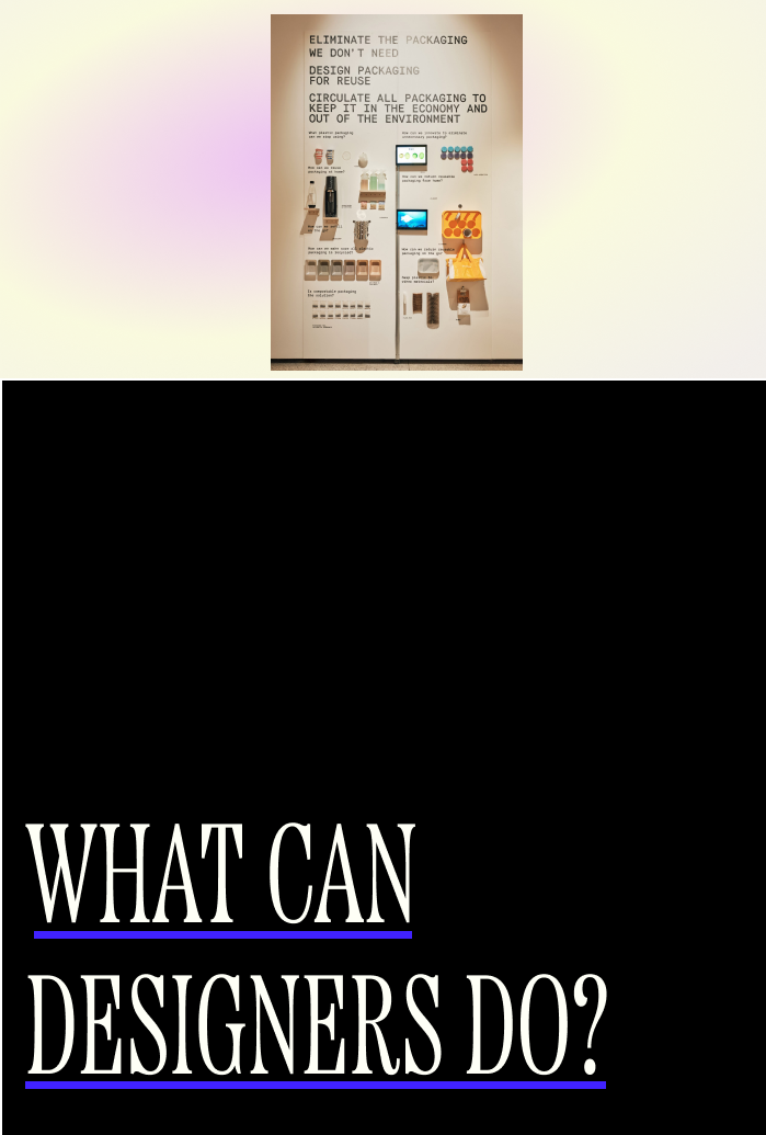
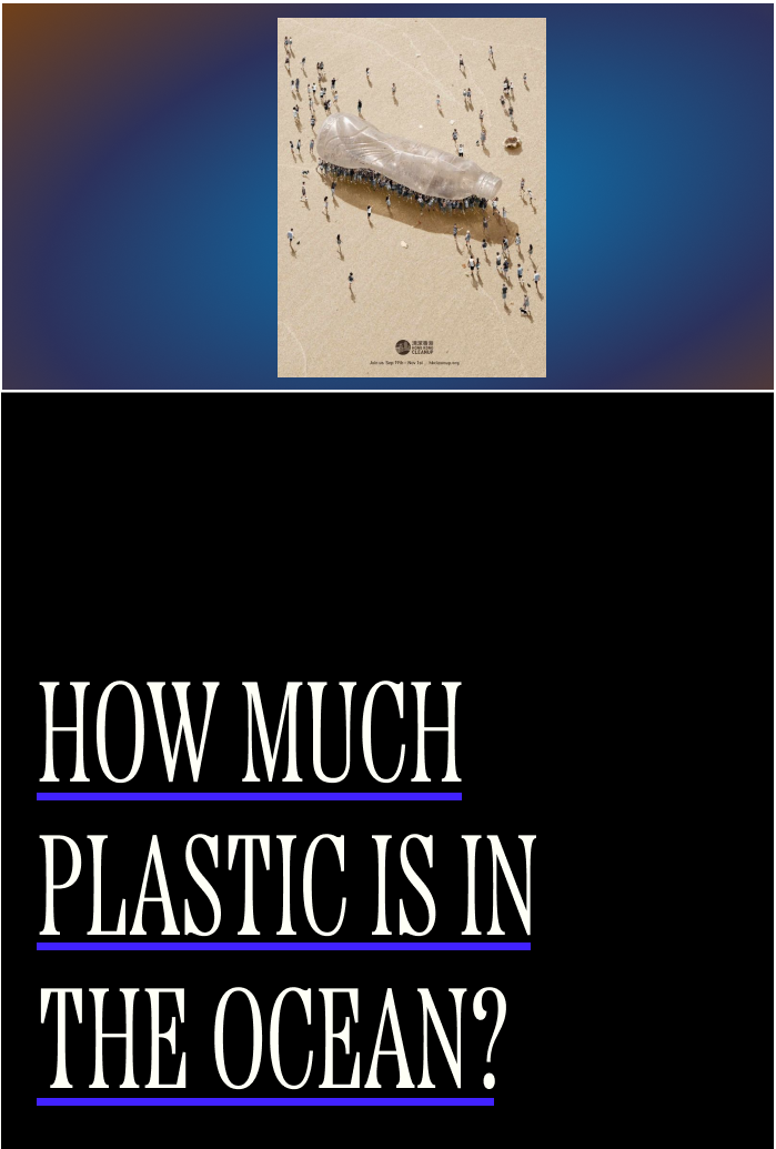
The Waste Age
Focusing on typographic and visual skills to create interactive website from the article “The Waste Age.”
Context: 376 Advanced Typography
Duration: 3 weeks
Applied methods: Typesetting, visual hierarchy
Tools: Figma
Created two scrollable sections of the screen with the main article and questions. Instead of pull quotes, significant parts of the article as
questions are highlighted to the side of the screen that users can hover over. Challenged myself typographically by pushing to find a way to have a scale change within
the website.
![]()
![]()
![]()
Created two scrollable sections of the screen with the main article and questions. Instead of pull quotes, significant parts of the article as questions are highlighted to the side of the screen that users can hover over. Challenged myself typographically by pushing to find a way to have a scale change within the website.

Reflecting
With climate issues being so pertinent to today, I struggled
in the ideation process to feel content with a concept that shed light enough
light on the weight of these issues, but still making it visually and interactively
compelling. After many rapid ideation spurts, I am happy to deliver an outcome that
balanced the areas of content, typography, and interactivity.
Reflecting
With climate issues being so pertinent to today, I struggled in the ideation process to feel content with a concept that shed light enough light on the weight of these issues, but still making it visually and interactively compelling. After many rapid ideation spurts, I am happy to deliver an outcome that balanced the areas of content, typography, and interactivity.
With climate issues being so pertinent to today, I struggled in the ideation process to feel content with a concept that shed light enough light on the weight of these issues, but still making it visually and interactively compelling. After many rapid ideation spurts, I am happy to deliver an outcome that balanced the areas of content, typography, and interactivity.
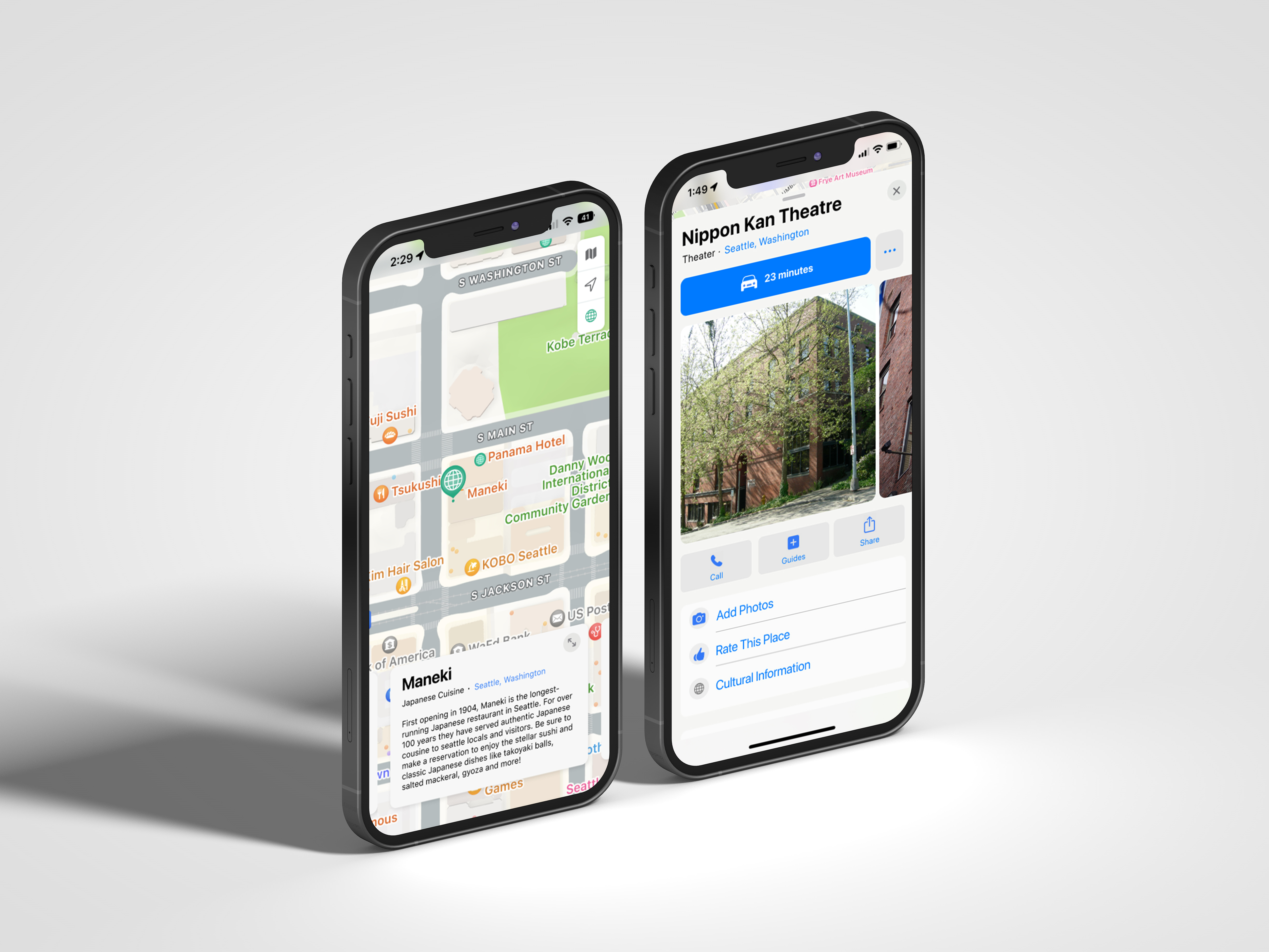
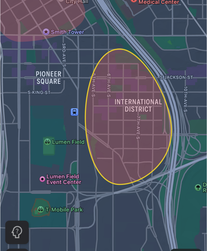
Apple Maps Culture Layer
Overview: Two ways users can use feature on Apple Maps
that increases users’ cultural awareness
that increases users’ cultural awareness
Context: Introduction to Interaction Design
Team: Faith Ong & Evelynn Li
Applied methods: Crazy 8s, competitive analysis, rapid user research,
prototyping, wireframing, information architecture, user flows
Team: Faith Ong & Evelynn Li
Applied methods: Crazy 8s, competitive analysis, rapid user research,
prototyping, wireframing, information architecture, user flows
Problem
︎︎︎ Cultural ignorance and laziness
Our team realized cultural education and awareness is often not prioritized and is typically a low priority feature within big platforms, which can lead to a prone to cultural misunderstandings and offenses, and general lack of empathy.
Background Research
We wanted to learn how important it is for users to learn about different cultures.
How important is cultural awareness to you?
Out of 10 average
9.3
Out of 10 average
What resources do you use when wanting to learn about a new culture?
• Google
• Social media
• School events
Was there ever a time you felt culturally uneducated visiting a new place?
Have experienced this feeling.
75%
Have experienced this feeling.
Relevant Insights
Users are aware of the benefits of cultural awareness day-to-day and while traveling
Should provide educational opportunity of the history of different places
Former iterations
Rationale for not moving forward:
Idea for highlighting where denser cultural
information is did not adhere visually to
current design language.
Rationale for not moving forward:
Card with cultural guideline information that
should be lower in the hierarchy; plays too high
of a role in the information architecture despite the information not being of greatest user value.
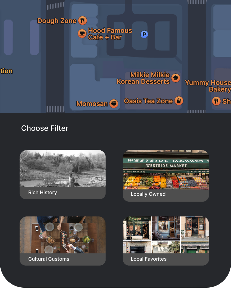
Rationale for not moving forward:
Having a drawer with filters did not draw
enough focus to our goal of cultural education;
knew there was a better way to design for
this user goal.
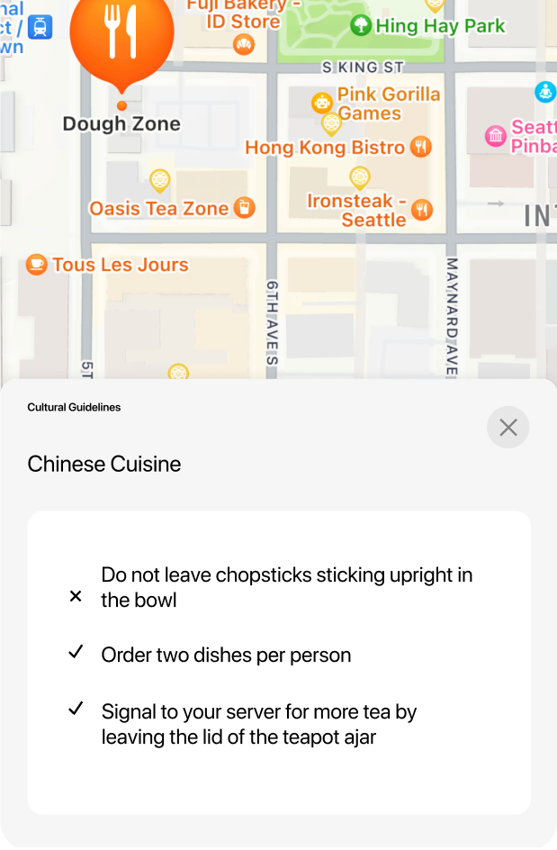
User Testing Prototype
Relevant user insight on usability:
“I would read the information if I had the time, but if I was in a hurry I wouldn’t but try to read later.”
Relevant user feedback on funtionality:
“Once you know how it works and what its for, its seems very self-explanatory”
User Journeys
Based off our user testing, we noticed that this feature
would be mainly used while users are traveling or have extra
time to browse the map, but not as likely to use it when simply
heading to a destination in their day-to-day life. These
insights supported our design rationales by creating two
different flows that would show this feature.


Final Videos
Reformation In-Store App
Overview:
How can searching for Reformation’s sustainability practices be transformed as an in-store experience?
Context: Interface Design
Duration: 5 weeks
Applied methods: UX/UI Design, Creative Direction
Tools: Figma
︎︎︎This project is under construction
Thank you for your patience.